This is just a glimpse of the tools we use to decode the markets. Our indicators are continuously refined and expanded with new developments, ensuring they remain relevant in changing conditions. As the markets evolve, so does our toolkit — always with the goal of delivering sharper, more meaningful insights...
How Pretiorates Approaches Market Analysis
At Pretiorates, every market insight begins with a disciplined, data-driven approach. We combine years of hands-on trading experience with a suite of proprietary indicators developed and refined over decades. These tools aren’t off-the-shelf — they’re born from real market conditions, tested in both bull and bear cycles, and continuously adapted to changing environments.
While our foundation is quantitative, we recognize that markets are influenced by more than numbers. That’s why we integrate technical frameworks such as Elliott Wave, Fibonacci analysis, and Point & Figure charting, alongside our own custom metrics. This blended methodology gives us a broader perspective — one that captures both the measurable and the psychological forces moving markets.
The result: insights that go beyond predictions and focus instead on understanding what the market is actually telling us.
Some Charts & Indicators
harts and indicators are the foundation of our market interpretations. Each one has been built, tested, and refined through real-world trading, capturing the dynamics that matter most to investors. Some track the flow of large institutional players, others measure sentiment, momentum, or the balance between buyers and sellers — but all are designed to provide a clearer picture of market behavior.
In the sections below, you’ll find a selection of our key tools, each explained in plain language so you can understand not just what the chart shows, but why it matters. Together, they form the lens through which Pretiorates views and interprets the markets.
Smart Investors Action
The “Smart Investors Action” indicator tracks the behavior of large investors, as they have a significant influence on index movements. By isolating their activities, we create a new curve. The light blue area highlights the deviation from the actual price development. An upward movement signals accumulation (bullish), while a downward movement indicates distribution (bearish). Red areas mark phases with high volume, which we refer to as “exaggerations.” The stronger these are, the higher the probability of a reversal—especially when a yellow dot appears, signaling an important “exaggeration point.”

Optimism/Pessimism of Investors
We use various tools to measure the strength of sentiments such as optimism and pessimism. During optimistic phases, negative surprises are better absorbed, meaning that they do not immediately lead to sharp corrections. Similarly, positive surprises during pessimistic phases are not rewarded with rising prices. However, optimism or pessimism can also become too strong, making trend reversals possible.

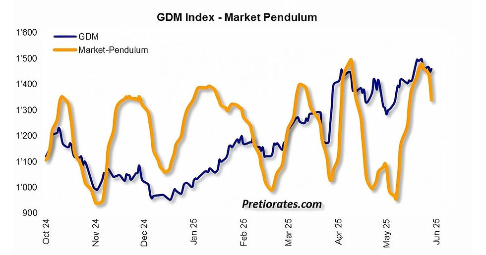
Market Pendulum
A pendulum swings freely back and forth under the influence of gravity, with the direction changing at a similar point each time. These alternating swings can also be seen on the stock market, which is never a one-way street. Even in the strongest trends, there are counter-movements. When the pendulum is falling, a decrease in upward momentum can be expected – and vice versa. This indicator is used for short-term timing. It can be used for fine-tuning the timing of investment decisions that have already been made.

Balance of Powers
The Balance of Power indicator measures whether the bulls or bears have greater strength based on cumulative daily movements. If the indicator reaches a high level, the bulls are likely to have exhausted their strength soon – and vice versa. If the indicator rises, bulls are better able to cope with negative surprises – and vice versa. Positive surprises, on the other hand, are always met with stronger gains – and vice versa.

Asset Strength
This indicator measures the strength of a trend for a specific asset based on various criteria. If the strength rises into the green zone, an investment should be considered. If the indicator falls back into the red zone, an investment in this specific asset is usually unattractive. This indicator is also interesting for asset management, where assets with a strength in the green zone are overweighted.

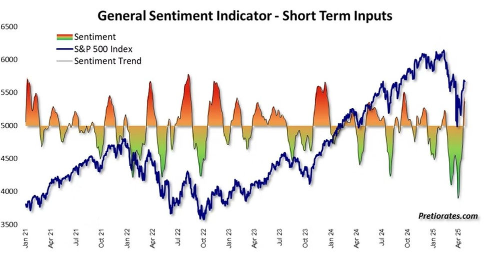
General Sentiment Indicator
We use various tools to measure the strength of sentiments such as optimism and pessimism. During optimistic phases, negative surprises are better absorbed, meaning that they do not immediately lead to sharp corrections. Similarly, positive surprises during pessimistic phases are not rewarded with rising prices. However, optimism or pessimism can also become too strong, making trend reversals possible.

